Fleur & Foundry

FULL BRAND IDENTITY DESIGN

Fleur & Foundry is a floristry and event design studio built around the belief that colour is the most powerful thing in the room.

The brief called for a blend of boldness and beauty. It needed to be bold enough to reflect the arrangements, and beautiful enough to attract wedding clients. With florals at the centre of it all, I created a brand that rests perfectly between the two. The brand palette which consists of a deep Maroon softened by Creams, and pops of Lavender and Green add to the fun and colourful personality of the brand.

To honour their love of colour and craft, every design decision was made with intention. Refined serif typography carries the elegance, and hand-drawn illustrations bring in the warmth and artistry that sits at the heart of everything they create.
Fleur & Foundry wordmark logo embossed on a soft lavender background.
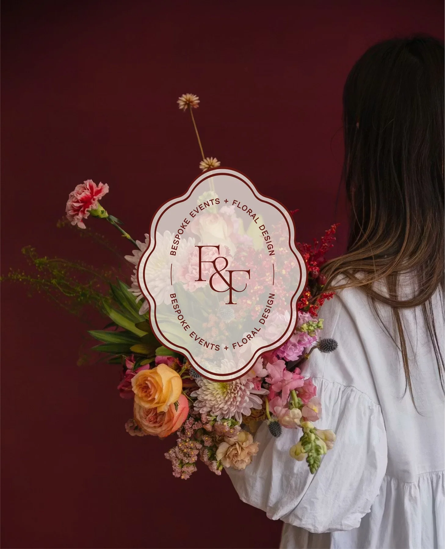
Woman from behind holding flowers beside an oval Bespoke Events and Floral Design badge logo.
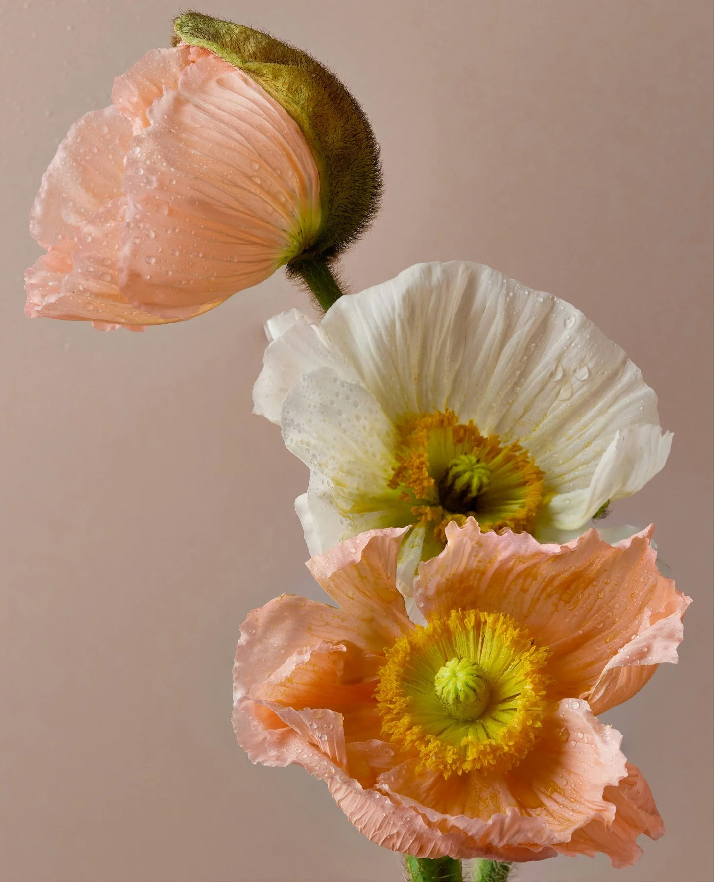
Close-up of three peach and white poppy blooms with dew droplets on the petals.
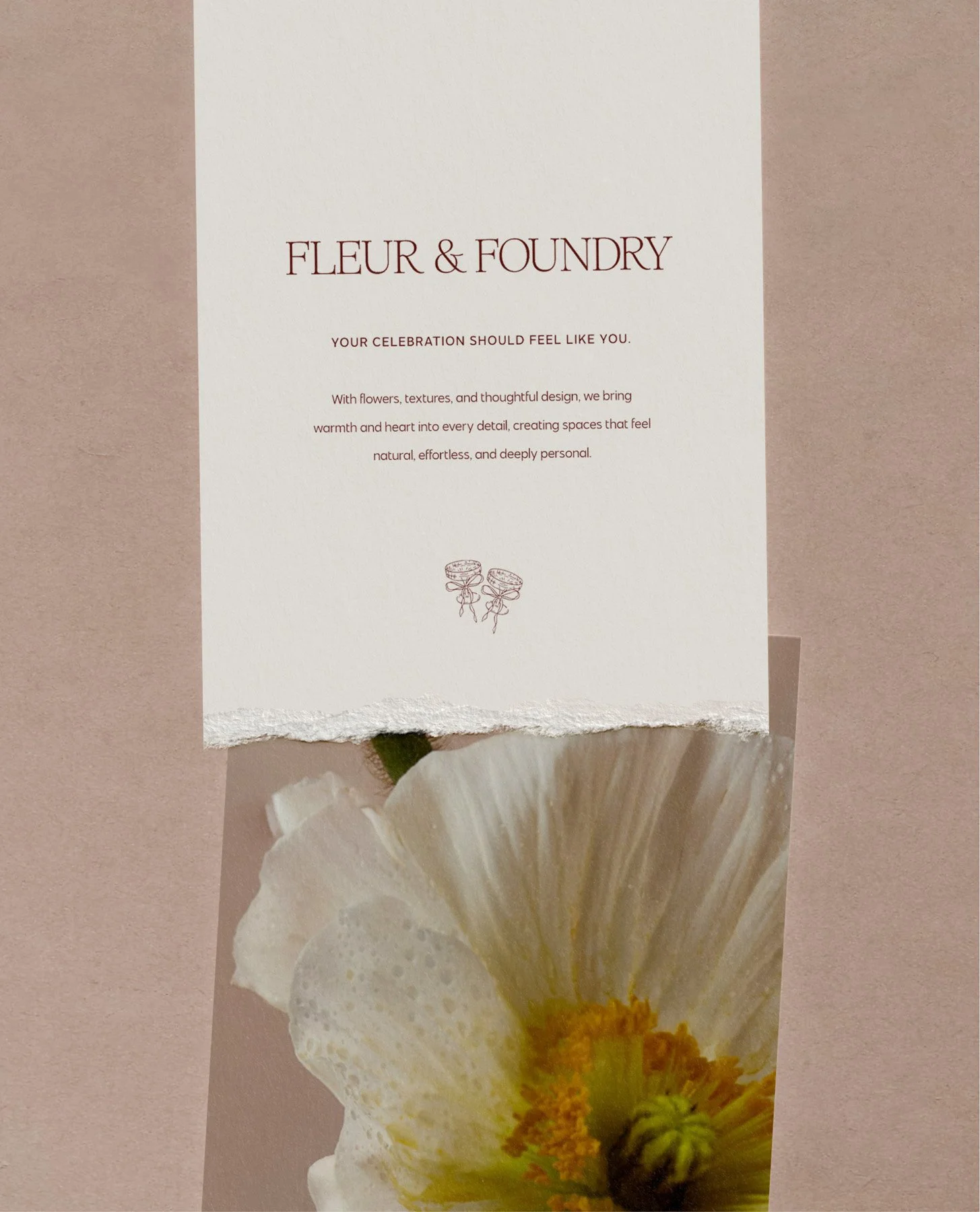
Torn stationery card showing the Fleur & Foundry name and tagline above a poppy photo.
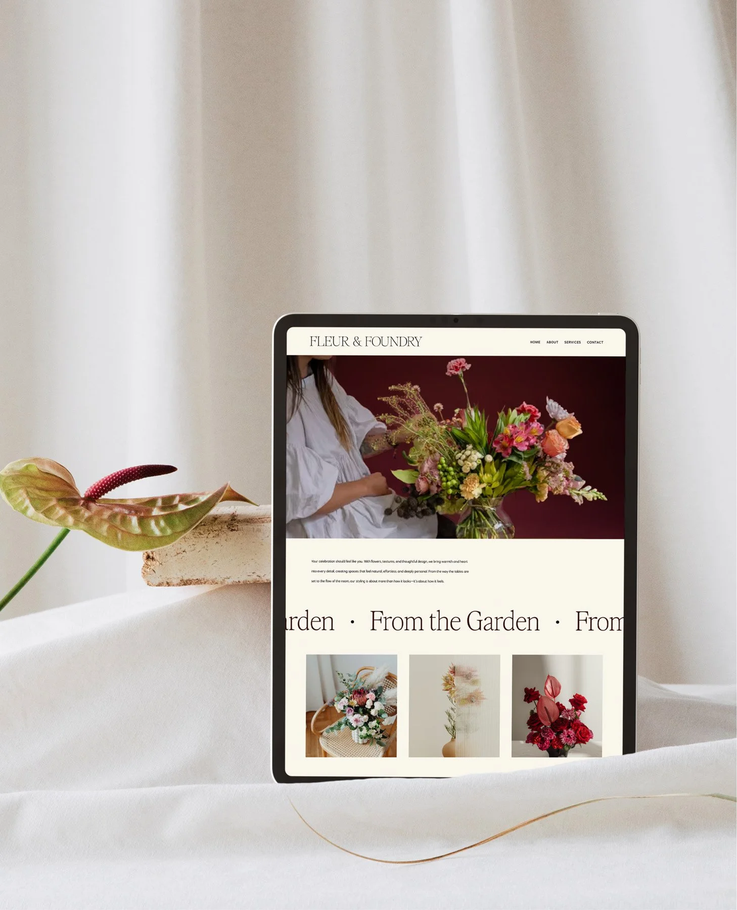
Tablet displaying the Fleur & Foundry website homepage with a floral hero photo and gallery.
Fleur & Foundry wordmark and tagline embossed on a green background.
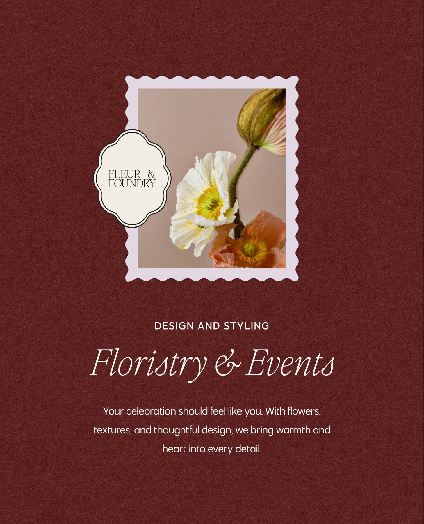
Brand font suite with a framed poppy photo, badge logo, and "Floristry & Events" headline.
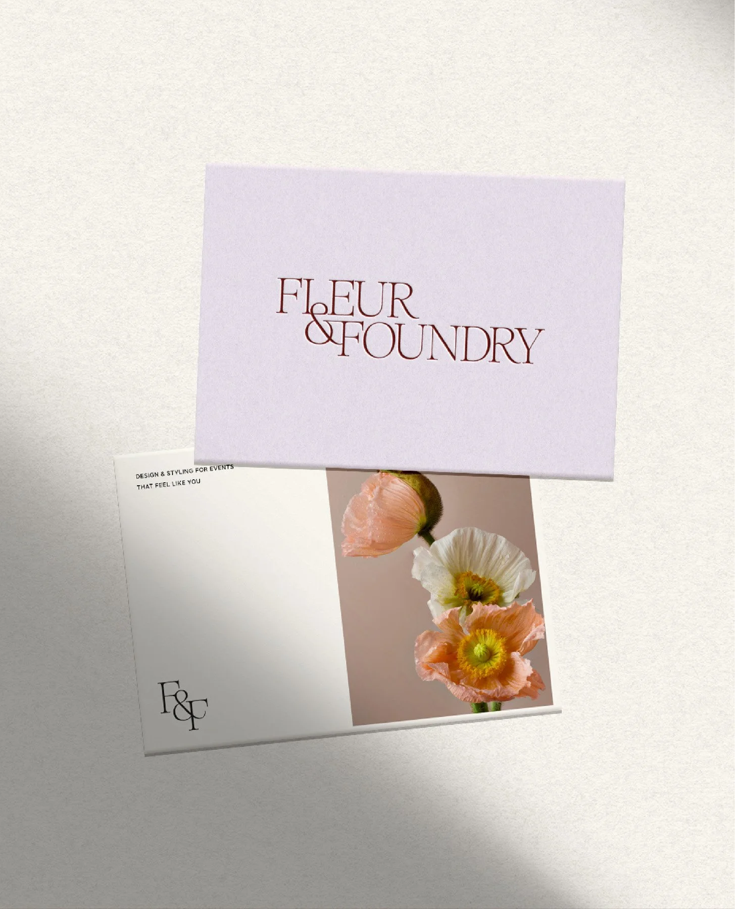
Lavender envelope and postcard mockup featuring the Fleur & Foundry logo and a poppy photo.
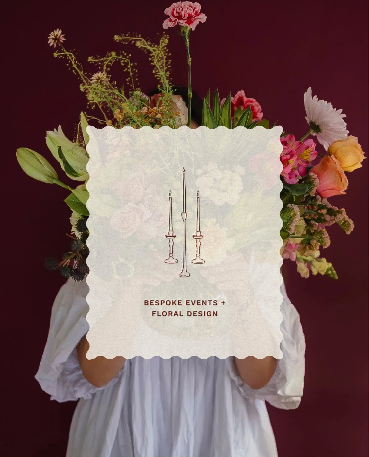
Woman holding flowers with a scalloped card overlapping with a candle icon and branding tagline.
Close-up line illustration of two ribbon-tied goblets in a hand-drawn style.

Start Your Project

Previous
Previous

South Coast Swimwear

Next
Next

Nadine Emily Photo